Dividing Content into Visual Pages in CSS
By Daniel Huigens on Thursday, May 21 2015
Airborn OS is a secure alternative to Google Docs.

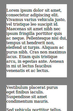
Unlike Google Docs, Airborn OS (or rather Firetext, the text processing app) doesn't include a custom renderer for text documents. Instead, it uses the browser's built-in html viewing and editing capabilities. This means that if we want to divide content into visual "pages" that correspond to the pages that would come out of a printer, we'd have to do it in CSS (or a combination of CSS and JavaScript). Can it be done?
It sure can, with some trickery. The trickery consists of two steps:
- Divide the content into CSS3 Columns. Thanks to the foresight of the creators of the Columns spec,
column-count: 1happens to do exactly what we want: divide into columns with a specific width and height. Rotate the columns so they are under each other instead of next to each other, and rotate the content so it's the right way up:writing-mode: vertical-lrandwriting-mode: initial. This tells the browser it should order text (and columns) from top to bottom.
Unfortunately, this trickery only works in Firefox and then only if you setlayout.css.vertical-text.enabledtotrue. If you do that, you can see a working demo here.
This trick no longer works since Firefox 40. Instead, you can use transforms to rotate the columns.
Even when support is enabled by default in Firefox, there are still unsolved problems: it's hard to style individual "pages" much further than in the demo (padding, box-shadow and border don't work on individual pages; outline does but is buggy). (Edit: the new box-decoration-break CSS property should solve this, but it's only supported in Firefox and even there it's slightly buggy.) When you enable editing text more problems arise, for example this bug.
Also, before you use this on your own website, there's a debate to be had if pages improve readability. Still, it's a cool trick and it's amazing that it works at all.
For a related technique to show only one page at a time, see this article.